5 データ解析に向けて
ここまでの解説で、Excelファイルとcsvファイルの読み込みについて一通り解説してきました。この段階では、まだデータがきれいでなくて、解析に入れないことも多いと思います。
5.1 要約値や欠損データの確認
まずどんなデータがどのように入っているか、欠損値(NA)はどれくらい発生しているか確認することは重要なプロセスです。変数の一覧を要約して確認することが簡単にできるskimパッケージのskimr()関数を使って確認してみましょう。データは2.1.1で読み込んだdfを使います。
skim(df)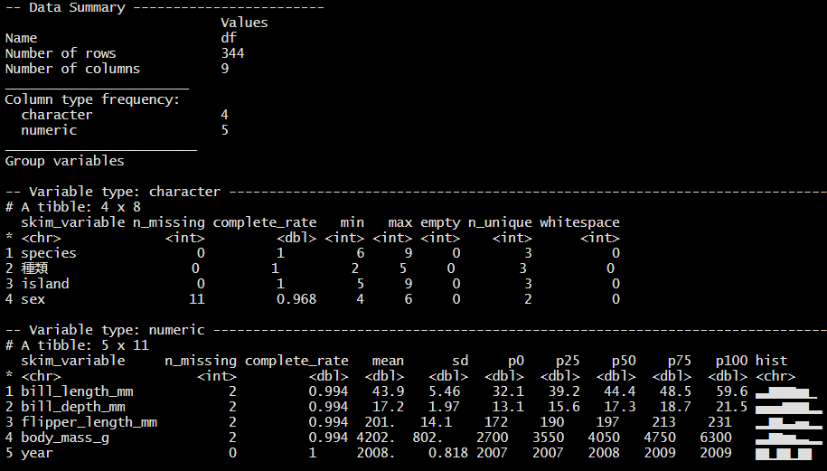
Figure 5.1: skim()の出力
データの型が数値である変数(ここではVariable type:numeric)については、hist列に簡単なヒストグラムが表示されます(図5.1)。しかしデータが大量な場合、動作が遅くなります。その場合は、ヒストグラムを描かない以下の関数が使えます。
5.1.1 結果をExcelファイルに出力する
as_tibble()関数を使うことで、結果を一つのデータフレームにまとめることができます。
## # A tibble: 6 × 17
## skim_…¹ skim_…² n_mis…³ compl…⁴ chara…⁵ chara…⁶ chara…⁷ chara…⁸
## <chr> <chr> <int> <dbl> <int> <int> <int> <int>
## 1 charac… species 0 1 6 9 0 3
## 2 charac… 種類 0 1 2 5 0 3
## 3 charac… island 0 1 5 9 0 3
## 4 charac… sex 11 0.968 4 6 0 2
## 5 numeric bill_l… 2 0.994 NA NA NA NA
## 6 numeric bill_d… 2 0.994 NA NA NA NA
## # … with 9 more variables: character.whitespace <int>,
## # numeric.mean <dbl>, numeric.sd <dbl>, numeric.p0 <dbl>,
## # numeric.p25 <dbl>, numeric.p50 <dbl>, numeric.p75 <dbl>,
## # numeric.p100 <dbl>, numeric.hist <chr>, and abbreviated
## # variable names ¹skim_type, ²skim_variable, ³n_missing,
## # ⁴complete_rate, ⁵character.min, ⁶character.max,
## # ⁷character.empty, ⁸character.n_uniqueこれで好きなように加工してExcelファイルとして出力することが可能になります。例えば、数値変数だけに絞る場合は
res_skim_df |>
  filter(skim_type  == "numeric") |>
  select(skim_type, skim_variable,
         n_missing, numeric.mean, numeric.sd)
## # A tibble: 5 × 5
## skim_type skim_variable n_missing numeric.mean numeric.sd
## <chr> <chr> <int> <dbl> <dbl>
## 1 numeric bill_length_mm 2 43.9 5.46
## 2 numeric bill_depth_mm 2 17.2 1.97
## 3 numeric flipper_length_mm 2 201. 14.1
## 4 numeric body_mass_g 2 4202. 802.
## 5 numeric year 0 2008. 0.818また、group_by()を使ってグループ別に上記結果を出すことも可能です。
res_df_num_g <-
df |>
  group_by(種類) |>
  skim() |>
  as_tibble() |>
  filter(skim_type  == "numeric") |>
  select(skim_type, skim_variable, 種類,
         n_missing, numeric.mean, numeric.sd)

res_df_num_g
## # A tibble: 15 × 6
## skim_type skim_variable 種類 n_mis…¹ numer…² numer…³
## <chr> <chr> <chr> <int> <dbl> <dbl>
## 1 numeric bill_length_mm アデリー 1 38.8 2.66
## 2 numeric bill_length_mm ジェンツー 1 47.5 3.08
## 3 numeric bill_length_mm ヒゲ 0 48.8 3.34
## 4 numeric bill_depth_mm アデリー 1 18.3 1.22
## 5 numeric bill_depth_mm ジェンツー 1 15.0 0.981
## 6 numeric bill_depth_mm ヒゲ 0 18.4 1.14
## 7 numeric flipper_length_mm アデリー 1 190. 6.54
## 8 numeric flipper_length_mm ジェンツー 1 217. 6.48
## 9 numeric flipper_length_mm ヒゲ 0 196. 7.13
## 10 numeric body_mass_g アデリー 1 3701. 459.
## 11 numeric body_mass_g ジェンツー 1 5076. 504.
## 12 numeric body_mass_g ヒゲ 0 3733. 384.
## 13 numeric year アデリー 0 2008. 0.822
## 14 numeric year ジェンツー 0 2008. 0.792
## 15 numeric year ヒゲ 0 2008. 0.863
## # … with abbreviated variable names ¹n_missing, ²numeric.mean,
## # ³numeric.sdあとは、以下のように出力するだけです。
write_xlsx(res_df_num_g, "out/種類別平均値(全数値型変数).xlsx")5.1.2 可視化
さらにggplot2を使って可視化することも可能になります。
res_df_num_g |>
  filter(skim_variable %in% c("bill_length_mm", "bill_depth_mm",
                             "flipper_length_mm", "body_mass_g")) |>
  ggplot(aes(x = 種類, y = numeric.mean, fill = 種類)) +
   geom_col() +
    theme(axis.text.x = element_text(size = 5)) +
   facet_wrap(vars(skim_variable), scale = "free")
ただし、ここの場合もっと潤沢な可視化グラフは元データから作成できます。例えば
df |>
  select(種類, bill_length_mm, bill_depth_mm, flipper_length_mm,
         body_mass_g) |>
  pivot_longer(-種類,                  # wideデータからlongデータに変換
               names_to = "variables",
               values_to = "scores") |>
  ggplot(aes(x = 種類, y = scores, fill = 種類)) +
   geom_boxplot(alpha = 0.3, width = 0.3) + # 箱ひげ図
   geom_violin(alpha = 0.3) +               # バイオリンプロット
    theme(axis.text.x = element_text(size = 5)) +
facet_wrap(vars(variables), scales = "free")詳しくは特別付録のggplot2の辞書を参照ください。
5.2 相関の確認
変数同士の相関関係を見たいという要望はビジネス、アカデミックを問わず多く発生すると思います。簡単な相関行列の出し方やその可視化について解説します。ここで便利なパッケージがcorrrです。
5.2.1 相関行列を出す
まずペンギンデータの中の数値変数だけにしぼります。そして、yearはここでは不要なので落とします。そうして作ったデータフレームcor_dfを、correlate()関数に入れるだけです。
cor_df <-
df |>
  select(where(is.numeric)) |> # 数値変数だけにしぼる
  select(!year)                 # 不要なので落とす


correlate(cor_df)
## # A tibble: 4 × 5
## term bill_length_mm bill_depth_mm flippe…¹ body_…²
## <chr> <dbl> <dbl> <dbl> <dbl>
## 1 bill_length_mm NA -0.235 0.656 0.595
## 2 bill_depth_mm -0.235 NA -0.584 -0.472
## 3 flipper_length_mm 0.656 -0.584 NA 0.871
## 4 body_mass_g 0.595 -0.472 0.871 NA
## # … with abbreviated variable names ¹flipper_length_mm,
## # ²body_mass_g上側と下型で相関係数が重複しているので、片側だけを残したい場合があります。その際はshave()関数で簡単に重複部分をなくせます。引数にupper = FALSEと入れれば、上側だけにすることもできます。
相関係数の表示したい桁の指定は、fashion()関数で、引数にdecimals =で桁数を指定することで可能になります。
##                term bill_length_mm bill_depth_mm flipper_length_mm body_mass_g
## 1    bill_length_mm
## 2     bill_depth_mm            -.2
## 3 flipper_length_mm             .7           -.6
## 4       body_mass_g             .6           -.5                .9
あとは、以下のように出力するだけです。
write_xlsx(cormat, "out/相関行列.xlsx")